In the UI (User Interface) design world, styles and trends come and go, shaping how we interact with digital devices. Among these trends, two design styles stand out: skeuomorphism and neumorphism. Both have distinct characteristics, advantages, and challenges. Understanding these styles is crucial for businesses, designers, and organizations to create engaging, user-friendly interfaces.
This blog, written by TheWebsiteExchange, explores the origins, features, and applications of skeuomorphism and neumorphism. We’ll also compare their strengths and weaknesses, helping you decide which style best suits your next project.
____________________
Evolution of UI Design
Before diving into skeuomorphism and neumorphism, let’s take a moment to understand the evolution of UI design. Initially, digital interfaces were complex and difficult for users to understand. Designers needed a way to make these tools intuitive, and skeuomorphism became the solution.
Over time, as users grew familiar with digital tools, simpler and cleaner styles like flat design gained popularity. Flat design is practical and modern, but some find it too minimalistic. This led to the rise of neumorphism, which combines simplicity with subtle depth, bringing a fresh perspective to digital design.
Get in Touch with Our Team
____________________
Understanding Skeuomorphism
i. What is Skeuomorphism?
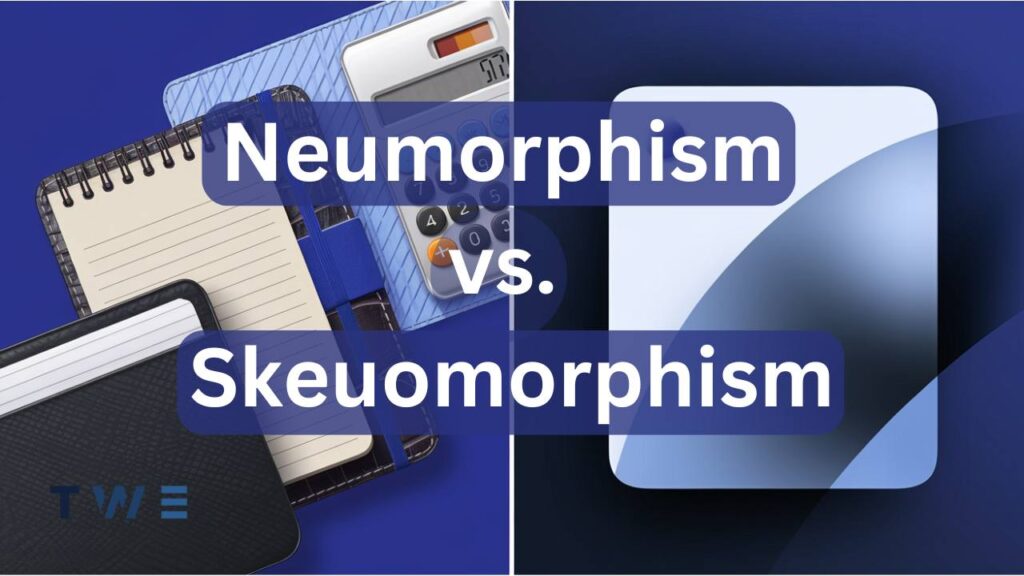
Skeuomorphism is a design approach that imitates real-world objects. It uses textures, details, and shadows to make digital elements look and feel familiar. The goal is to connect the physical and digital worlds, helping users navigate tools effortlessly.
For instance, a calendar app that resembles a physical calendar is skeuomorphic. It leverages our understanding of real-world objects to make digital interactions feel natural.
ii. Key Features of Skeuomorphism
- Realistic Textures: Designs often include leather, wood, metal, or paper textures.
- Detailed Shadows and Highlights: These create depth, making elements appear three-dimensional.
- Familiarity: Interfaces mimic objects users recognize, like buttons that look like they can be pressed.
iii. Historical Context
Skeuomorphism was dominant in the early days of UI design. Apple played a significant role in popularizing this style, especially under Steve Jobs. Early iOS interfaces, such as the Notes app with its yellow legal pad design and the Calendar app, which mimicked a desk calendar, are prime examples.
However, by 2013, the introduction of iOS 7 marked a shift toward flat design, emphasizing simplicity and removing unnecessary visual elements. This change reflected users’ increasing comfort with digital interfaces.
____________________
Exploring Neumorphism
i. What is Neumorphism?
Neumorphism, short for “new skeuomorphism,” is a design trend that combines aspects of skeuomorphism and flat design. It emerged around 2020 as a modern approach to UI design. Neumorphism focuses on clean, minimalistic elements with soft shadows and highlights, creating a subtle three-dimensional effect.
Unlike skeuomorphism, neumorphism doesn’t mimic real-world textures. Instead, it uses light and shadow to give digital elements a tactile quality.
ii. Key Features of Neumorphism
- Soft Shadows and Highlights: Creates an embossed or debossed look by playing with light and shadow.
- Minimalist Aesthetic: Simplifies design by removing unnecessary details and focusing on essential elements.
- Color Harmony: Interfaces often use a monochromatic palette where elements blend seamlessly with the background.
iii. Popularity and Adoption
Neumorphism gained attention for its unique visual appeal, especially on platforms like Dribbble and Behance. Designers showcased neumorphic concepts for smart home apps, fitness trackers, and dashboards. Apple’s macOS Big Sur also featured neumorphic elements, further boosting the trend’s visibility.
However, despite its aesthetic charm, neumorphism has faced criticism for accessibility challenges, limiting its widespread adoption.
____________________
Skeuomorphism vs. Neumorphism: A Detailed Comparison
i. Visual Appeal
- Skeuomorphism offers a rich, detailed look that feels familiar and engaging. Its designs can evoke nostalgia, making users feel comfortable and connected.
- Neumorphism provides a sleek, modern aesthetic. Its clean and futuristic appearance appeals to contemporary tastes and works well in minimalist interfaces.
ii. User Experience
- Skeuomorphism excels in creating intuitive designs, especially for users new to digital tools. By mimicking real-world objects, it bridges the gap between the physical and digital worlds.
- Neumorphism can feel less intuitive because it prioritizes aesthetics over functionality. Low contrast and subtle shadows can make interactive elements harder to identify.
iii. Accessibility
- Skeuomorphism is generally more accessible. Its high contrast and detailed elements make it easier for users with visual impairments to navigate.
- Neumorphism struggles with accessibility. Its low contrast and reliance on soft shadows can make interfaces difficult for individuals with limited vision or color blindness.
iv. Implementation
- Skeuomorphism is straightforward with pre-designed textures and patterns, but it can become resource-intensive if overused.
- Neumorphism requires precise control over shadows, highlights, and spacing, making it more complex and time-consuming to implement effectively.
____________________
Pros and Cons
i. Skeuomorphism
Pros:
- It is intuitive for beginners due to familiar visuals.
- Engaging and visually rich, creating an immersive experience.
- High contrast enhances usability and accessibility.
- It is ideal for nostalgic designs or apps targeting older audiences.
- Easy to convey the purpose of elements (e.g., a camera icon that looks like a real camera).
Cons:
- It can look outdated compared to modern design trends.
- Overuse of textures may create cluttered interfaces.
- Less adaptable to small or high-resolution screens.
- It can feel overwhelming in data-heavy applications.
- Limited flexibility for creative, abstract designs.
ii. Neumorphism
Pros:
- Sleek and modern, aligning with minimalist trends.
- Creates a sophisticated, futuristic look.
- Works well for simple, focused applications.
- Encourages innovative layouts and unique aesthetics.
- Visually pleasing for showcasing products or prototypes.
Cons:
- Accessibility challenges due to low contrast.
- Less intuitive for users unfamiliar with minimalistic designs.
- It is not suitable for complex interfaces with many elements.
- Demands more resources and time to design and implement.
- Risk of prioritizing aesthetics over functionality, leading to usability issues.
Get in Touch with Our Team
____________________
Real-World Applications
i. Skeuomorphism in Practice
Skeuomorphism is effective in projects where familiarity and realism are essential. Examples include:
- Early iOS Designs: Apple’s Notes, Calendar, and Contacts apps used skeuomorphic elements to help users transition to digital platforms.
- Music Apps: Apps like Overcast mimic physical instruments or controls like drum pads or sliders.
- Educational Tools: Skeuomorphic designs are useful in e-learning apps, where real-world visuals help explain concepts.
ii. Neumorphism in Practice
Neumorphism is ideal for projects that prioritize aesthetics and simplicity. Examples include:
- Smart Home Apps: Neumorphism complements modern, futuristic interfaces for controlling devices like lights and thermostats.
- Fitness Trackers: Its minimalist style suits health and activity apps with simple, focused features.
- Dashboards and Prototypes: Designers use neumorphism to showcase innovative layouts and explore new design possibilities.
____________________
The Future of UI Design
UI design trends are cyclical, and skeuomorphism and neumorphism have left a lasting impact. While skeuomorphism emphasizes familiarity, neumorphism pushes the boundaries of modern design.
Emerging trends like glassmorphism (which uses transparency and blur effects) and neubrutalism (bold, raw, and unpolished designs) reflect the influence of these styles. The key takeaway is that good design is not about following trends but balancing aesthetics, usability, and accessibility.
Discover how custom web design in California can boost your online presence by reading our detailed guide on Custom Web Design in California: How It Can Boost Your Online Success.
____________________
FAQs
1. What is the difference between skeuomorphism and neumorphism?
Skeuomorphism mimics real-world objects, using textures and details to create familiarity. Neumorphism blends flat design and skeuomorphism, focusing on minimalism and soft, subtle depth.
2. Which is better for accessibility?
Skeuomorphism is better for accessibility because it uses high contrast and clear visuals. Neumorphism’s low contrast can make it difficult for users with visual impairments.
3. Can these styles be combined?
Combining skeuomorphic familiarity with neumorphic minimalism can create a balanced design that appeals to a broad audience.
4. What are some alternatives to these styles?
Other popular UI design styles include flat design, material design, glassmorphism, and neubrutalism.
5. Is neumorphism practical for real-world applications?
While neumorphism is visually appealing, its accessibility challenges limit its practicality. It works best for simple interfaces or conceptual designs.
____________________
Conclusion
Skeuomorphism and neumorphism offer distinct approaches to UI design. Skeuomorphism creates intuitive, familiar interfaces, while neumorphism appeals to modern sensibilities with its sleek, minimalist look. Choosing the right style depends on your audience, goals, and priorities.
At TheWebsiteExchange, we specialize in crafting innovative, user-centric designs. Whether you prefer the richness of skeuomorphism or the elegance of neumorphism, our team can help bring your vision to life. Contact us today to elevate your digital presence.